Sunday, February 26, 2012

Live Album Cover, Part II


So I decided to change the album a bit, to redesign one of my favorite Live albums, The Dolphins Cry, and mix it up with the Secret Samadhi recreation.


I first removed the background of the photo of the band in Photoshop.


 This is a screenshot also, of my dolphin that was rendered in 3ds Max Studio.


As seen in the last blog post, this was my preliminary recreation. I started with this.


I hid all the layers, and added a solid black layer covering half the page. I also hid the mask(that was created in Illustrator), and the text "Secret Samadhi"


I then layered the image of the group, and re-added the mask. The mask was recolored to a light gray, and the image of the group was given an inner shadow.


Finally, I added the text "The Dolphins Cry", and added the image of the dolphin over the middle of the album cover.


Finally, I changed the opacity of the dolphin to 50%, and added a glow effect to the dolphin.


Tuesday, February 21, 2012

Rough Draft of Album


This is the original image which I worked with.
One of my favorite bands, Live. This is their original album cover.

In this rough draft please note that I am only RECREATING the album cover. I will make changes later on, or I may even scrap this entirely and do something else. 


I traced this image in Illustrator using the live trace tool. Then opened it up in Photoshop to fill in the rest.


Here, I expanded the canvas, and filled the the mask with a solid black color


Next, I filled the background with a charcoal color.


Here, I added typesetting, and the red line over the "I" is used with the shape tool.

 Album Cover, recreated.
Album cover, with denim background, colored mask, and beveled typesetting.

Monday, February 13, 2012

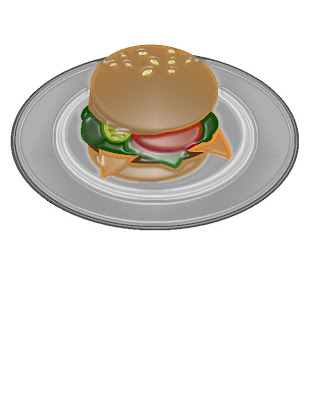
2d Cartoon Burger, Final


I opened up Photoshop and added textures, gradients, and bevel(using the FX function via layers). The burger buns have gradients applied to them, the burger patty and lettuce have bevel/textures applied to it, and the sesame seeds on top have shadows and bevel on them. The pickle has a bevel, shadow, and textures applied to it, and the tomato slice has a gradient on the skin. The plate which the burger sits on also has a bevel/shadow applied to it.

Finally, I applied a shadow to the burger.

Tuesday, February 7, 2012

Recreation of Cheeseburger in Illustrator


One of the reasons I enjoy 3d so much and 2d not as much- I have problems creating images in 2d! I hope to improve my 2d skills this semester however. The first project is to recreate an image in Adobe Illustrator. So here is my first attempt.

The first image on the left side is the original image. This was a render of a simple cheeseburger that I created earlier in 3ds Max.


Here on the left is the recreation of the cheeseburger in 2d, recreated in Illustrator. This image was created using the shape tools, and was created layer by layer, beginning with the bottom half of the bun.


This image here is the same image with the plastic warp feature applied to it.

Thursday, February 2, 2012

Diner


Currently, I am working on modeling a 50's style diner, and the image shown above is part of my scene that was rendered in 3ds Max. I hope to not only improve my skills, but to learn new techniques and create higher quality textures for my 3d work.


Maybe I'm putting the cart before the horse today, but I got bored working on my diner, and skipped over to the blue plate specials. Here is my err...interesting looking burger, inspired by a burger I had at Wendy's earlier. Maybe I'll fix the warped textures another time, but right now, my 6 month old son is calling!